

Table of Contents
- Light Bulb Color Temperature Chart
- What Changes When You Compare Bulbs Side by Side?
- 2700K vs. 3000K
- 3000K vs. 4000K
- 4000K vs. 5000K vs. 6500K
- Kelvin, Lumens, and CRI Measure Different Things
- Which Light Bulb Color Works Best in Each Room?
- Kitchens That Open Into Living or Dining Areas
- Bathrooms With a Vanity Mirror
- Porches, Patios, and Garden Paths
- How to Mix Light Bulb Colors in the Same Space
- How to Compare Light Bulb Colors at Home
- FAQs
Change one bulb over a white countertop and the whole kitchen can look different. Under 2700K, the counter may take on a creamy cast. At 4000K, its gray undertones can become easier to see. Both bulbs can have the same lumen rating. The change you’re seeing is the color of the light reaching the surface.
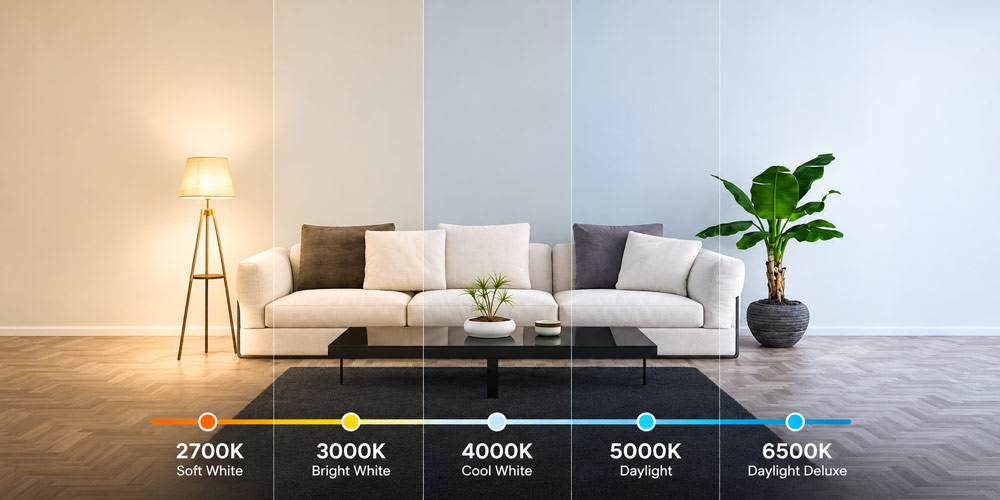
For a familiar incandescent glow, start at 2700K. For warm white with less yellow, try 3000K. For a more neutral look over a work surface, compare 3500K and 4000K. Bulbs labeled 5000K to 6500K give a cooler, daylight-like appearance, with the blue-white character most apparent at the upper end.
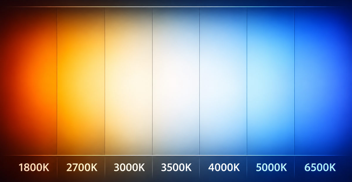
Light Bulb Color Temperature Chart
The Kelvin rating, shown as K on a bulb package, describes how warm or cool white light appears. Lower values look more golden or yellow. Higher values look whiter and then increasingly blue-white. For LED bulbs, this specification is usually called correlated color temperature, or CCT. It describes how closely the bulb’s light color matches the glow of an ideal heated reference surface.
| Color temperature | Common packaging label | Real-world comparison | Where to try it |
|---|---|---|---|
| 1800K–2200K | Extra warm white, candlelight | The amber glow around a candle or a vintage-style decorative lamp | Decorative pendants, low-level accent lights, intimate dining areas |
| 2700K | Soft white, warm white | A traditional incandescent table lamp shining through a cream shade | Bedrooms, living rooms, dining rooms, and covered porches |
| 3000K | Warm white | The warmer end of halogen-style lighting, with a milder yellow cast than 2700K | Kitchens with warm finishes, hallways, bathrooms, and entryways |
| 3500K | Neutral white, bright white | White paper under a lamp that looks less yellow than a typical living-room lamp | Home offices, kitchens, and rooms that serve several purposes |
| 4000K–4100K | Neutral white, cool white | The crisp white light often seen in offices or utility rooms | Bathroom vanities, laundry rooms, desks, and workbenches |
| 5000K | Daylight, cool daylight | The cool white appearance of a pale surface near a window on a bright day | Garages, workshops, and dedicated task lighting |
| 6000K–6500K | Daylight, cool daylight | The blue-white cast you may notice on a pale surface in open shade | Dedicated work areas where a distinctly cool white is preferred |
Packaging terms vary. Soft white often means 2700K or 3000K, while daylight can describe anything from a crisp 5000K to a more noticeably blue-white 6500K. If you’re replacing one bulb in a fixture, look for the printed Kelvin number on the bulb or its packaging. The daylight examples in the chart are visual references. Actual daylight changes with the time of day, weather, and whether a surface is in direct sun or shade.
What Changes When You Compare Bulbs Side by Side?
2700K vs. 3000K
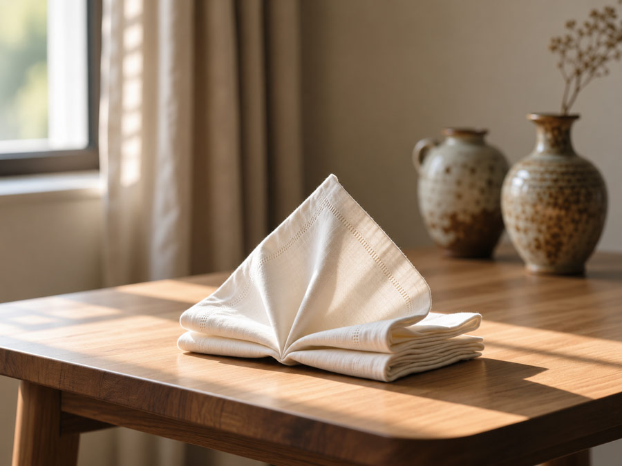
Set a white linen napkin on a honey-colored wood table. Under 2700K, the linen can look closer to ivory and the wood may take on a richer golden tone. At 3000K, the linen usually looks a little closer to white while the wood retains its warmth.
That difference matters when you’re lighting pale fabrics, cream paint, brass, or timber. Try 2700K first if you want to preserve the look of a traditional incandescent lamp. Try 3000K if you like warm light but want a milder yellow cast across larger surfaces, such as white walls or kitchen cabinets.
3000K vs. 4000K
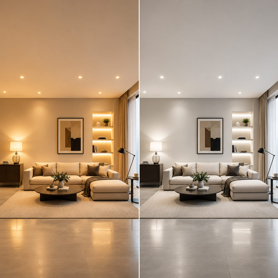
Look at a sample of greige paint beside gray tile. At 3000K, the beige undertone may be more noticeable. At 4000K, the same paint can look more gray, and brushed steel or white trim may appear crisper. Which result looks better depends on the finishes you want to emphasize.
3500K is worth testing when 3000K gives a room more yellow than you want and 4000K feels too cool. It can work well in a multipurpose room where you read, work, and spend time in the evening under the same fixtures.

4000K vs. 5000K vs. 6500K
Put a sheet of white paper and a gray storage bin on the same workbench. 4000K generally gives both objects a neutral to slightly cool appearance. 5000K produces a more distinctly daylight-like white. At 6500K, the blue-white cast becomes easier to see, particularly with a warmer bulb in view.
For a garage that doubles as a workshop, try 4000K for general lighting and test 5000K over the bench if you prefer a cooler working light. Assess the light with an actual task, such as reading small markings on a tool. The beam and the amount of light reaching the workbench affect how easy those markings are to see.
Kelvin, Lumens, and CRI Measure Different Things
Kelvin describes light color. A 2700K bulb and a 5000K bulb can both be rated at 800 lumens. The first gives a warmer white and the second a cooler white, even though their rated total light output is the same. A typical 60-watt incandescent replacement gives you a familiar shopping reference of roughly 800 lumens for output and 2700K for color.
Lumen output describes how much visible light a bulb emits. The fixture, shade, and beam determine where that light goes. An 800-lumen spotlight can put more light on the center of a counter than an 800-lumen bulb that spreads light in all directions. The light reaching the counter is called illuminance and is measured in lux. Use watts to compare how much electrical power the bulbs draw.
The color rendering index (CRI) describes how faithfully a light source renders object colors compared with a reference. A general CRI of 90 or higher is a useful starting point when you care about the appearance of skin, food, textiles, paint, or artwork. If a specification sheet also lists R9, check it when saturated reds matter. R9 is the score for a red test sample outside the average used to calculate general CRI. It gives you extra information about how the bulb may render red details in lipstick, food, or fabrics.
Michalski, S., & Druzik, J. (2020). LED lighting in museums and art galleries (Technical Bulletin 36). Canadian Conservation Institute, Department of Canadian Heritage.
Which Light Bulb Color Works Best in Each Room?
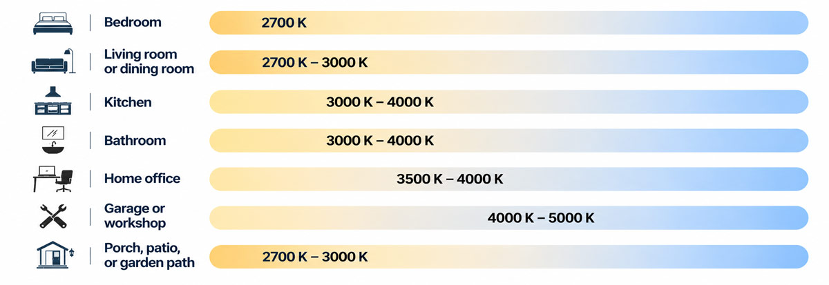
| Space | Color temperature to try first | What to check in the room |
|---|---|---|
| Bedroom | 2700K | Check the bedside lamp from your reading position. A shade that directs light onto the page can make reading easier while keeping the rest of the room softly lit. |
| Living room or dining room | 2700K–3000K | Look at faces, upholstery, and the tabletop with the fixtures you usually switch on together. |
| Kitchen | 3000K–4000K | Use the counter as your test surface. Try 3000K with warm wood or cream cabinets, and compare 3500K or 4000K if you want a crisper look on white or gray finishes. |
| Bathroom | 3000K–4000K | Judge the light at the mirror. Check how it falls across your face and how clearly you can distinguish similar cosmetic or clothing colors. |
| Home office | 3500K–4000K | Read a printed page and look at your screen from your normal seat. Adjust the position of the desk lamp if you see reflections. |
| Garage or workshop | 4000K–5000K | Check small markings, tool edges, and the shadows your hands cast while you work. |
| Porch, patio, or garden path | 2700K–3000K | Look at the entrance or path from the direction you normally approach it. Check whether the light reaches the threshold, paving, or steps. |
Kitchens That Open Into Living or Dining Areas
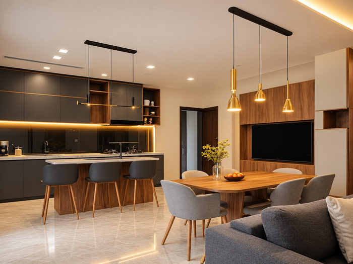
In an open-plan room, start with one color temperature for fixtures that illuminate the shared space. For example, 3000K pendants and ceiling lights can give the kitchen and dining area a consistent warm appearance. If you need more light for prep, use a separately controlled under-cabinet fixture aimed at the counter. Stand where you normally chop or read a recipe. If your body blocks the ceiling light, adding light directly to the work surface will address the shadow more effectively than changing the ceiling bulbs’ Kelvin rating.
Hathaway, N., Ang, A., Suk, J. Y., & Siminovitch, M. (2023). Residential lighting: A guide to meeting or exceeding California’s 2022 building energy efficiency standards. California Lighting Technology Center, University of California, Davis.
Bathrooms With a Vanity Mirror
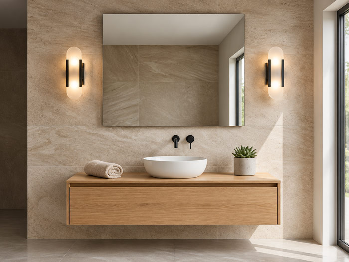
When choosing a light bulb color for a bathroom, evaluate the result at the mirror from your normal standing position. A ceiling light directly overhead can cast shadows under the eyes and chin. Diffused lighting beside the mirror helps illuminate the face more evenly. Try 3000K if you like the room’s warm finishes and want a comfortable everyday setting. Compare 3500K or 4000K if you prefer a more neutral appearance for grooming.
Figueiro, M. G. (2001). Lighting the way: A key to independence. Lighting Research Center, Rensselaer Polytechnic Institute.

Porches, Patios, and Garden Paths
When comparing 2700K and 3000K landscape lighting, test each color on the material the light will actually hit. A cedar fence or warm brick can take on a more golden appearance at 2700K. Pale paving, gray stone, and light stucco may look closer to their daytime color under 3000K.
At a step or threshold, look for even coverage and a clearly visible edge. Aim light down toward the walking surface and check the fixture from both directions. Even a warm bulb can be uncomfortable to look at if the bare lamp is visible at eye level.
How to Mix Light Bulb Colors in the Same Space
Match fixtures that illuminate the same surface at the same time. In a row of pendants or a pair of sconces on one wall, different Kelvin ratings can leave overlapping yellow and blue-white patches. Look at the wall from across the room, where those patches may be easier to spot than from directly beneath a fixture.
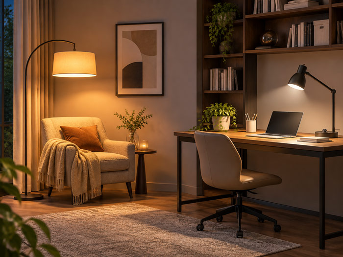
Different temperatures can work when the lights serve distinct areas. A 2700K floor lamp can illuminate an armchair while a 3500K task lamp lights a desk across the room. A focused shade keeps the desk light on the work surface, and separate switches let you use it only when you need it.
Check transitions between rooms after dark. If a 4000K hallway looks noticeably cooler through the doorway of a 2700K living room, try 3000K or 3500K in the hall and see how the two spaces look from the usual sightline.
How to Compare Light Bulb Colors at Home
- Choose two nearby Kelvin ratings. Start with 2700K and 3000K for a warm room, or 3500K and 4000K for a more neutral room. Pick bulbs with similar lumen ratings and beam spreads so you can judge the effect of color.
- Use the same fixture and shade. Test one bulb at a time. A cream fabric shade, tinted glass, or a reflective fixture interior can affect the light that reaches the room. Use the fixture where the bulb will actually go.
- Look at three familiar surfaces. Use a matte white card to see the overall color cast, a finish sample to judge the room’s materials, and an object with a strong color to see how the light renders it. A paint sample, a piece of fabric, or a red apple will do.
- Check the room at the hours you use it. Compare the bulbs in daylight and after dark, with neighboring fixtures set as you normally use them. If you take comparison photos, keep the camera’s white balance and exposure fixed. Automatic white balance can make two different bulbs look more alike in photos than they do in person.
- Test the actual task before buying the full set. Read at the chair, stand at the bathroom mirror, or walk up to the front door. If the color looks right but the surface is hard to see, look at beam direction, glare, and the amount of light reaching it before choosing a different Kelvin rating.
FAQs
1. What do the codes 827, 830, and 840 mean on a light bulb?
In a common three-digit lamp color code, the first digit indicates the CRI range and the last two digits indicate the color temperature in hundreds of kelvins. An 8 indicates a general CRI in the 80s. 827 means 2700K, 830 means 3000K, and 840 means 4000K. If the digits appear inside a longer model number, check the product specifications to confirm that they are the color code.
2. Do LED light bulbs get warmer when dimmed?
Most fixed-white dimmable LEDs stay approximately the same color as their output drops. A dim-to-warm LED is designed to become more amber as it dims, much like a traditional incandescent bulb. Some models start around 2700K–3000K at full output and reach about 1800K at the low end. Check the bulb’s specified color range and dimmer compatibility if you want that effect.
3. Why do two LED bulbs with the same Kelvin rating look different?
A nominal rating such as 3000K covers a range of actual measurements. White light can also have a slight green or pink tint at the same color temperature. A specification called Duv describes the direction and degree of that tint relative to a heated reference source. Positive values generally lean greener, while negative values can lean pinker. For a single replacement in a multi-bulb fixture, start with the same bulb model and compare the lamps on a matte white surface.
4. What is the most flattering light bulb color for video calls?
For a room lit mainly by lamps, 3500K–4000K is a practical starting point. Place a shaded or diffused light in front of you, near eye level or slightly above it, so your face is evenly lit. If a window already provides most of the light on your face, try using it as your main source. Keeping one dominant light color across your face helps avoid a yellow cast on one side and a blue cast on the other.
5. Which outdoor light bulb color tends to attract fewer insects?
An amber or yellow outdoor bulb with low blue-light output can attract fewer flying insects than a broad-spectrum white bulb. The result depends on the species and the bulb’s actual spectrum, so two bulbs with similar Kelvin ratings can perform differently. Try amber near a porch seating area or frequently used door. If you rely on that fixture to distinguish colors clearly, check how the amber light affects the surfaces and objects you need to see.
